In this era or web and internet every company small/big has its presence on the social channels besides having a website of its own. As the main motive of making a website is to communicate with a target group of customers and to increase the brand awareness, so the designing must be as per the requirement of business company id doing. A good website is not just visually pleasing but has the work ability part and the user experience.
Company’s website tells a lot about its brand, services and philosophy, an aesthetically designed site decides whether the user will stay there for a while to communicate or not. A good website should have an engaging effect but against it a poorly designed website fails to impress the user. The resulting consequences are your website lags behind in the tough competition.
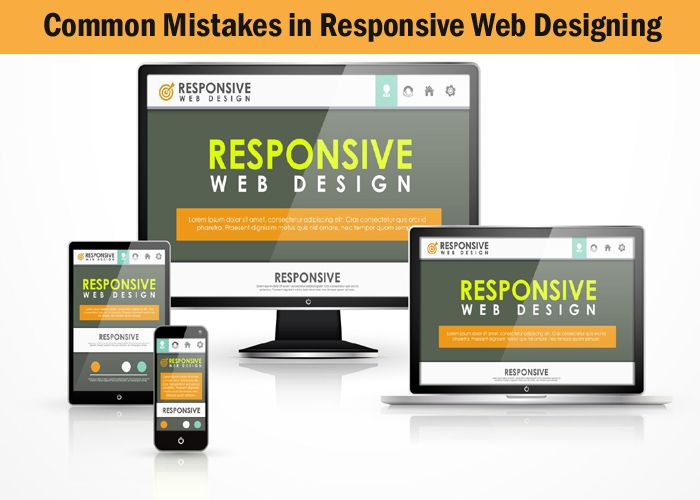
It takes hours and even days for a web designer to place different elements on the website but it is the user experience that says it all. Main elements that grab the attention of user are pleasing designs, eye catchy visual, some good illustrations and phrases on the screen in a balanced way, Today the trend favours Responsive website that equally works well across all platforms without wasting money to develop versions for varied platforms.
Even the expert web designer commit common mistakes while designing the responsive site that must be avoided as they can cost dearly
- Enormous Content — Content rules no doubt but stuffing the site with unnecessary contents one of the worst mistakes as it can affect the opening and loading speed of the website bringing it down. Content must be just appropriate and can be displayed at the top of the page for the user convenience.
- Complex navigation — Current times and trends term complex navigation a mistake and favours an easy navigation. Large and complex navigations turn off the user from the site so web designer is coming up with many novel ideas like using small screens with horizontal swiping and hidden navigation to enhance user experience.
- Slow loading speed of website — User normally does not have much patience when they browse the website to get some information to wait for slow loading and opening sites. The user may in frustration move to another website ignoring yours the result is lost traffic. Make sure website load quickly and display right information user is looking for.
- Using wrong colours — The colour combination is an important factor to grab the user attention so using the wrong combination of colours can have an unpleasing effect on the user. It is the designer’s job to choose colours as per the kind of website and company’s business so as to attract user’s attention as he/she logs in to your site.
- Using too much animation and images — Using Animations and images is normally good but yes putting too much of them can lower the loading speed of the website. Most expert web designers know this fact. Using flash animation on mobile websites can put a heavy burden on the speed this mistake can be avoided.
- Broken links — Links always matter for a blogging site or normally for all sites but only when they are wisely used good links can be used to increase more traffic to site but yes they are bit tricky particularly broken links. Links, if they are broken, will not direct the user to the right page and this can tarnish the image of the company so it’s always better to check the links whether they really work or not.
- Using pop up window option — Pop up window is a good option but using it not cautiously can really annoy the user .there should always be an option to for the user to close up pop-up windows if they don’t want to see it.
- Non Specific web designs — Irrelevant web designs is a mistake so they should have relevancy to the targeted audience, designing a website to please everyone is out of trend. Instead web designer should know the targeted customers which are a guideline in designing site as per the specific users.
- Unfriendly Mobile website — Today trend is of mobile as most users browse websites through their mobile so make sure your website is mobile friendly as ignoring this fact is too bad for the company.
- Inappropriate Negative spaces — Negative or say white spaces are in trend as they give a meaning to the web site but using inappropriate white spacing can make the site look too awkward. Curb the tendency to crowd the page with too many icons without proper white spaces can annoy the user as they look too cluttered for a user to understand it.

Separate the business entity from the owner
Having a business name does not separate the business entity from the owner, which means that the owner of the business is responsible and liable for all debts incurred by the business.
Having a business name does not separate
The creditors can go after the owner\’s personal possessions.
If the business acquires debts, the creditors can go after the owner\’s personal possessions